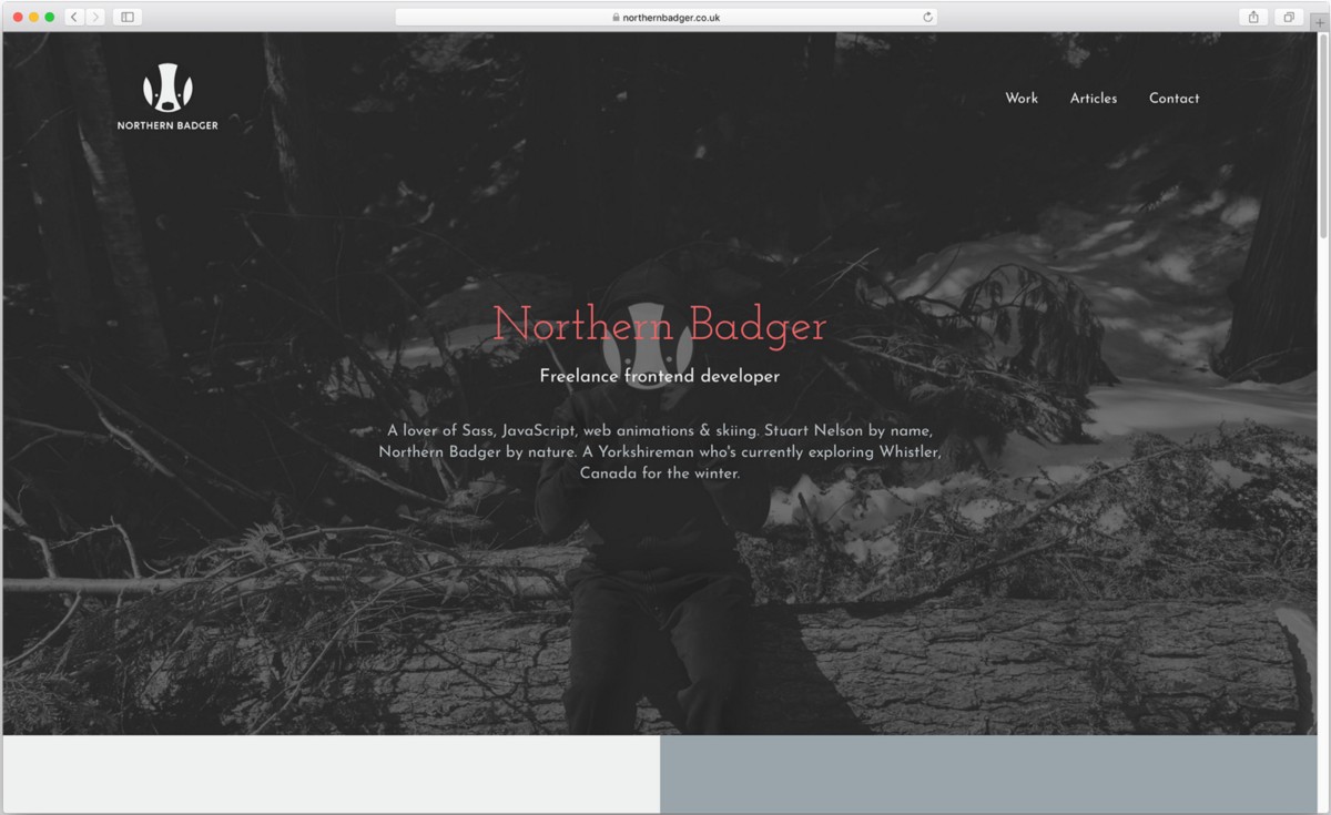
It’s a funny that a lot of web developers don’t have an up to date website. My guess is like myself, it’s hard to find time/enthusiasm to create your own site when you could be getting paid to make someone else. The Northern Badger website has been an inline SVG and two lines of text since I bought the domain 4 years ago. I‘ve started 3 versions of the website only to get loose interest/decided it was not good enough half way through and scrap the build.
In December 2017 I made a promise to myself this cycle of doom HAD TO END! I decided to treat building my own website as I would a client project. Heres how I approached it.
Jump to heading Creating a brief
As part of all my client projects we will work together to create a brief that accompanies my contract. This collaborative process is a way to drill down to find out what the client needs rather than what they want. As a massive bonus this also ensures both parties are clear on exactly what is being created for them are and what restrains the project has. Wether the restraints are budget, time or a technical requirement; it’s vital to get it agreed at the very start. For my website time was my constrain, I wanted to site live with the magical phase 2 complete by 26th March 2018. In January I wrote my brief that included;
- A mission statement for the project
- What I wanted to learn & new technologies I would use
- An outline of a three phased project plan
The final point I felt was really important for the project. To ensure I didn’t get bogged down with trying to build all the fancy enhancements/features from the start I proposed building the site in three stages. On my previous attempts to make a site I get bogged down doing the fun lastest-technology stuff and the site never gets built… I’m currently starting stage 3 where I will add my fancy enhancements.
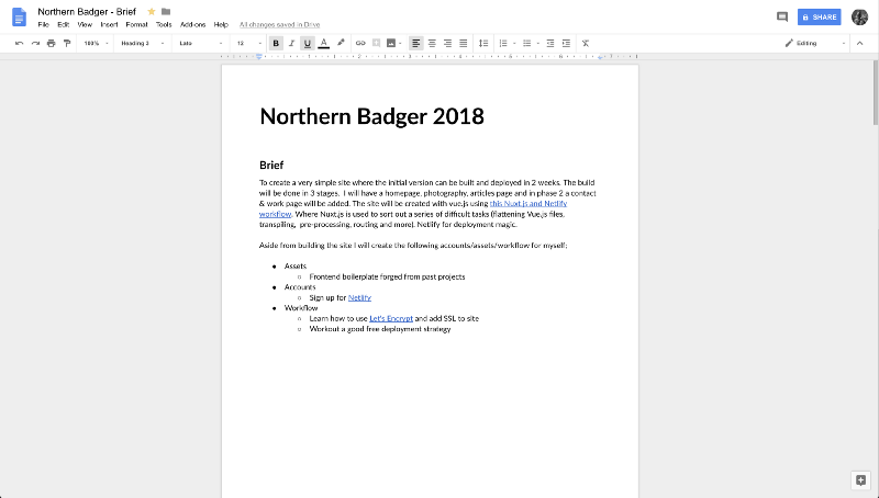
A screenshot of the first page of Northern Badger 2018 website brief
Jump to heading Creating wireframes
I love wireframes. If this is something new to you checkout this great article by InVision about creating wireframes. I have three stages to creating my wireframes;
- Research. I scour the web looking for relevant examples for inspiration from other sites. If possible it’s great to review a sites analytics data to see what devices and browser users have users have been using to access it.
- Pencil sketches. I sketched out my design ideas with pencil in my notebook. I really liked dotted notebooks for this as it helps drawing lines that are straight-ish. At this stage its about creating lots of different versions of the same thing, a real brain dump of creative ideas.
- Digital wireframes in Sketch. I transfer my favourite pencil sketches into Sketch so I have digital greyscale wireframes. This allowed me to explore different layouts and create a series of shared components. I create a bunch of Sketch symbols for the main elements/components to speed up the process of creating full page templates.
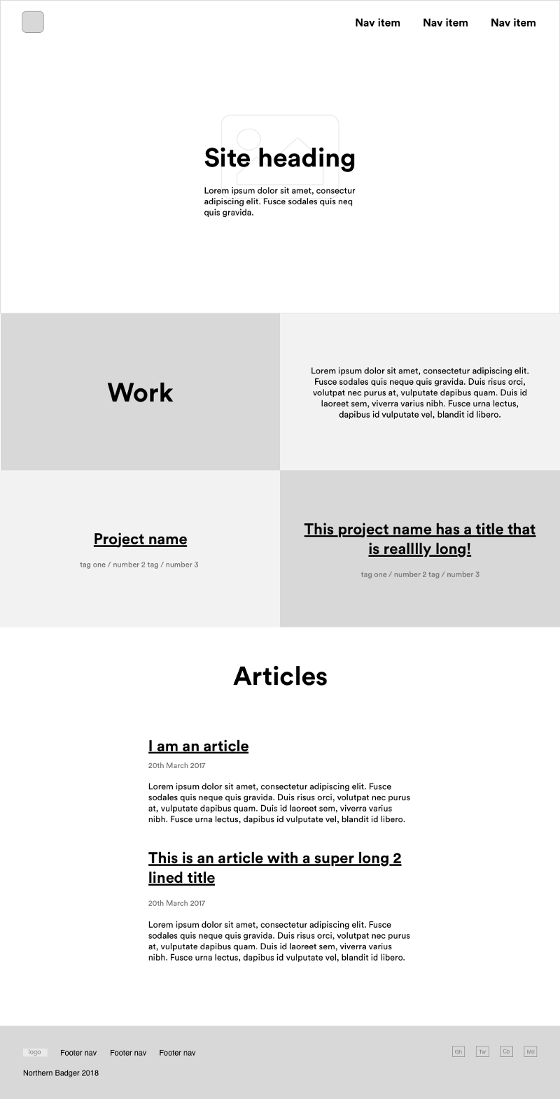
My homepage desktop Sketch wireframe
Jump to heading Full designs
While for this project I didn’t create full colour designs I did create some style guides to work from. These are effectively a designed version of my websites SCSS config with all the type setting, colours, spacing considerations among other useful global variables. I wanted to get the site built quickly and since the layout is very simple I just followed my style guide as well as brand guidelines. Since time was a constraint on the project this is one way I saved time.
Jump to heading Learning new technologies
A new project is a fantastic opportunity to learn! Over the last few months I have been learning Vue.js (it’s seriously awesome by the way) so I wanted to build the site using the framework. As well as using Vue.js I wanted to use;
- CSS grid for the enhanced layout
- Nuxt.js: a minimal framework for creating Vue.js applications with server side rendering, code-splitting, hot-reloading, static generation and more!
- Netlify for deployment. What doesn’t Netlify do for free? If you have a personal project that you want to deploy, secure and delivery performantly you’d be mental not to use it. I’ll write an article about it in April.
- Create a new simple Scss styles boilerplate that I can port over to new projects
Jump to heading Writing copy & getting artwork
Before developing the site I wanted to get my content together. Too many times in the past have I worked on projects that has an amazing design only for the client to write too much/too little copy and it ruins the design. I luckily didn’t have much copy to write for my site so it didn’t take me too long to create it. I was keen to create some some interesting slightly odd/cheeky photos for the website’s hero section. I had the idea to “dress up” as a badger. I printed off a copy of my logo on some card, borrowed a black onesie, some black shoes and my housemate helped me out taking pictures (shout out to Clare!). ideally I’d like to like to take new Badger photos each time I move so the picture has relevance to where I am currently living.

One of the images from the “Canadian badger” photoshoot
Jump to heading Building the site
Before coding anything I created a Trello board. I have a card for each major config task & component. I use colour labels to help me organise the cards and a series of lists based roughly on the scrum methodology.
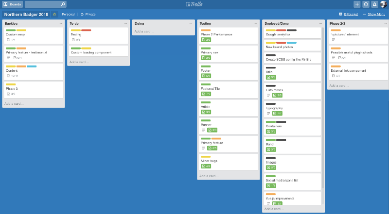
My Trello board for the Northern Badger website
I started development by using Vue-cli’s Nuxt.js project template. This comes with Vue router, Vuex Vue server side rendering and Vue meta. I then created my Sass styles. If you want to know more about how I use Sass with just checkout my Vue.js Sass article (how to expose Vue variables, mixing and functions so all Vue components as well as compiled all helper classes). After I’ve sorted out my Sass setup I create my components starting with the most commonly used (Primary navigation, banner, footer etc). Since I was using CSS Grid for my layout I wanted to follow Rachel Andrew’s technique for creating a very basic single column layout that would work in the most basic of browser first. IE11 was my base browser and I tested it using the free IE11 macOS virtual machine. When I was happy with my basic single column layout I enhanced it with CSS Grid. I’d watched most of Rachel’s gridbyexmaple.com videos a while ago and played cssgridgarden.com so I had a rough idea how the syntax worked. Alongside the videos and MDN for reference I had my “GRID IS THE BEST THING EVER TO HAPPEN TO CSS” moment. I will defiantly be using grid again on all future projects. I feel it positively enforces writing good HTML and progressively enhanced CSS.
Nuxt does so many of the boring jobs I’d have had to have done manually. Personally I like making websites not setting them up this is where I feel Nuxt really excels! I won’t go into too much detail here but my only real beef with Nuxt is the extra `
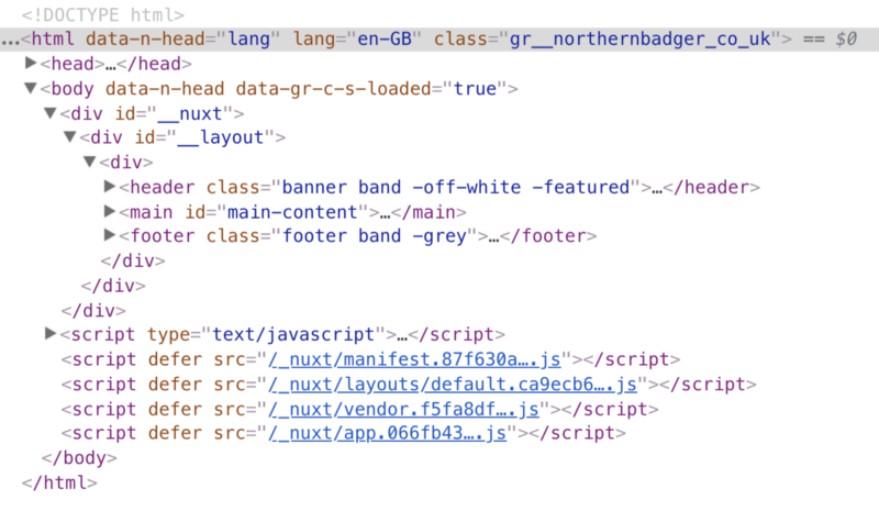
Showing source code for my static site and the extra wrapping div’s required for Nuxt to work
Jump to heading Testing
I wanted my site to work on IE11 and all latest major browsers. I borrowed my housemates phones to have a wider variety of real device to remote debug on, nothing can really replace testing on a real device. I’ll admit some change I made just before deployment broke the site on IE11… This is my first job to fix as its not ideal that it’s a white-screen-of-death. Even though I think its unlikely anyone will use IE11 to view my site, if I get it to work on IE11 I feel it will work on emerging browsers as well as being more accessible. I use waves browser extension for accessibility testing and Atom’s HTML validator package.
Jump to heading Deployment
This is where Netlify comes in. As long as everything is good with your static site build Netlify is so so so amazing. You just connect up your repo (integration with Github and Bitbucket among others), pick your deploy branch and enter your build command (npm run generate) and your site is deployed to a Netlify subdomain. BOOM! I wanted automatic continuous deployments so whenever I push an updated to my master branch my site is deployed! I also connected up my custom domain, used their GUI for adding environment variables, free SSL certificate from lets Encrypt with 2 buttons clicks, server side pre-rendering, asset optimisation & added email notifications for all deployments. There is a lot more you can do even on the free plan. If you want some more info on using Nuxt.js & Netlify checkout Jordon Simmons tutorial.
Jump to heading 3, 2, 1… It’s live!
Big thanks to everyone who viewed an early link and gave me feedback. I couldn’t recommend enough just asking people to take a look and let you know what they think. Even if it’s subjective feedback you don’t listen too, asking people you respect for their help aside from anything else is a great confidence booster.
A few times I reached out on Twitter, Netlify support & on Next.js community chat room for help. The thing I think I can improve on the most is not spending ages fiddling around trying to fix something I don’t properly understand. As a wise person on Twitter once wrote; “The best debugging technique is to take a break. Works every time”. Don’t be afraid to reach out. If someone is an idiot and shoots you down/laughs at you, quite frankly the jokes on them. As the very wise business guru Kat Fox once told me “Stu, the best way to get new work is just be a nice person”.
I don’t want to sound like an arse but I am super happy with my site! I don’t think its anything special in it’s design or the tech behind it. I’m pumped I managed to finally, on attempt 4, finish building a site for myself! I feel it’s pretty accessible, performant and gives a good overview of what I do/have done. The hard part is being the designer, developer, copy writer and client all at the same time. Treating it like a client project was the reason I managed to get it finished this time as well as ensuring I gave myself the time to do it.
Any questions/comments/bugs/feedback please get in touch! Thanks for reading.