I remember when I first came across Chris Coyer’s article; Quick Reminder that Details/Summary is the Easiest Way Ever to Make an Accordion.

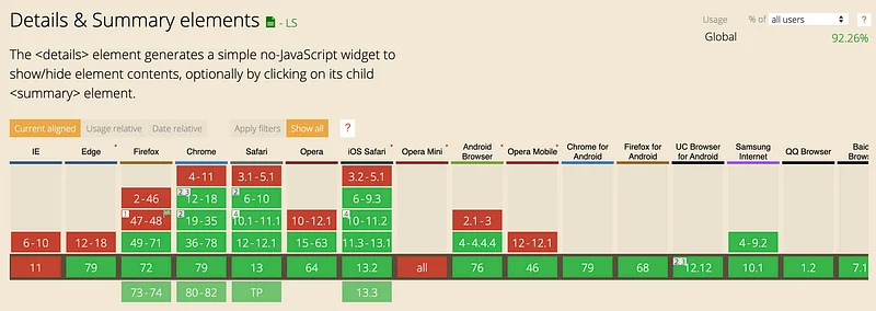
Total madness. When I built my accessible JavaScipt accordion, Badger accordion back in 2017 it took ages. Now in 30 seconds, you can build an accessible accordion using just HTML. At the time of writing the support for an HTML accordion according (see what I did there) to caniuse.com is 92.26% globally which is awesome. What about the 7.74% of users? Sure it’s a small percentage of users but it can look pretty funky when not supported… How do you create proper progressive enhancement for an HTML accordion? With very little effort you can create a really nice base experience.
Jump to heading The problem
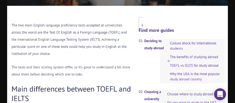
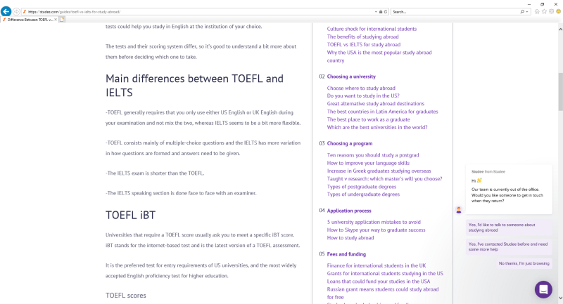
Hello IE11 my old friend. I’ve come to talk with you again. When we launched Studee.com website back in August 2019 we made a decision to not support IE11 at that time going of our usage statistics and limited resources. Here what it looked like in IE11/Edge (pre Chromium).

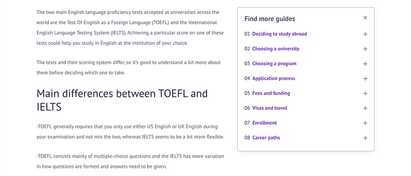
The sidebar does not look great… It should look like a nice list of nested accordions (see below). While we don’t support IE11 if we can fix a major functional bugs when we can.

Jump to heading Progressive enhancement — it is all about that baseline experience
I’m a huge believer in progressive enhancement. Going through this in detail is out of the scope of this article but Aaron Gustafson gives a great overview of progressive enhancement. The grid guru Rachel Andrew has a favorite article of mine about CSS Grid and progressive enhancement. For me, anyone should be able to access a website’s core functionality regardless of their connection, browser or device.
Working with our awesome designer we decided the base experience was a stacked list for browsers that didn’t support detail/summary. I’m really happy with the result. Now it’s easy for someone to digest the secondary nav no matter their browser.
Jump to heading The code
So the two main browsers causing issues that didn’t support the element were Microsoft Edge and IE11. All I did was using a feature query, enhancement the layout if the browser isn’t one of those.
.my-selector {
    [@supports](http://twitter.com/supports "Twitter profile for @supports") not (-ms-ime-align: auto) {
        ...my enhancement CSS for brosers that support <details>
    }
}
While this is targeting the Microsoft browsers I am pretty confident that older versions of other browsers that don’t support -ms-img-align will also not support feature queries so win, win!

Jump to heading Thanks for reading!
If you’d like to see the code check out any of our guide articles on studee.com. The screenshots in this guide are from the guide TOEFL vs IELTS for study abroad.
Any questions/comments/bugs/feedback please get in touch! Thanks for reading. If you have any examples of spinners you’ve made after reading this article I’d love to see them!
Big thanks to the awesome team at Studee for being 100% behind my work and putting accessibility to be at the heart of what we do.