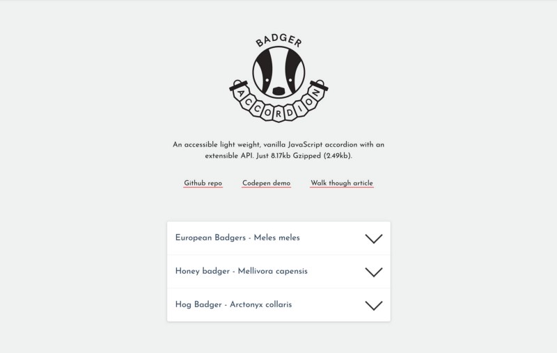
Like a lot of dev’s, I use open source tools all the time. From my text editor to the CMS that I work with to my regular searches of Stack Overflow. I thought it was about time I made a meaningful contribution to the open source community ( article about my experience of making first open source tool coming soon…). Drum roll please… without further delay here is; Badger Accordion!
Badger Accordion demo on Codepen
Jump to heading What is Badger Accordion?
It is an accessible, animated accordion built using vanilla JavaScript and a teeny tiny bit of CSS. It is just 6.14kb (minified) and Gzipped 1.86kb!
While working at Mr B & Friends we often needed to turn around small marketing websites pretty quickly. The most challenging part of this for me was balancing wanting to create the best possible code base against getting launching the site for the tight deadline. I like to think of it as art vs business of web development. Finding an accessible accordion that would animate between states, that didn’t use jQuery and had an extensible API was something I wasn’t able to find. So I had to build one, with a good dash of support from Dave Smith the cub (see what i did there badger fans?) was born!
Jump to heading Creating your markup
There is no fixed structure required for your markup, in my examples I have used a dl (as the WAI-ARIA Authoring Practices guide used it in their example). You will need to add 5 selectors for the plugin to work. The selectors listed below are the default selectors but can all be over written using the plugins options.
- The containing element,
dl,.js-badger-accordion - The header element,
button,.js-badger-accordion-header - The panel element,
dd,.js-badger-accordion-panel - The panel inner element,
div,.js-badger-accordion-panel-inner - The panel element for targeting with CSS,
div,.badger-accordion__panel. While you could use the selector from point 3 I would not recommend doing this. For keeping everything nice and separated best to use a different selector for targeting with CSS & JS.
<dl class="js-badger-accordion">
    <dt>
        <button class="js-badger-accordion-header">Header Content</button>
    </dt>
    <dd class="badger-accordion__panel js-badger-accordion-panel">
        <div class="js-badger-accordion-panel-inner">Panel Content</div>
    </dd>
</dl>
Jump to heading Adding essential CSS
For then plugin to work you will need the following CSS.
.badger-accordion__panel {
    max-height: 75vh;
    overflow: hidden;
}

.badger-accordion__panel.-ba-is-hidden {
    max-height: 0 !important;
}

.badger-accordion--initalised .badger-accordion__panel {
    transition: max-height ease-in-out 0.2s;
}
Jump to heading Creating a new instance of the plugin
I’m going to assume here that you will be using some form of bundler with your project. The easiest way to use the accordion is to download it using npm/yarn.
npm i badger-accordion
yarn add badger-accordion
Please note that currently the array-from-polyfill is being included as standard (but wrapped in a conditional check). If this is an issue for you or you have an awesome idea of how to include it please get in touch!
Import the package. Select your DOM node and pass it to a new instance of Badger Accordion.
import pollyfill from 'your/path/to/array-from-pollyfill';
import BadgerAccordion from 'badger-accordion';

const accordionDomNode = document.querySelector('.js-badger-accordion');
const accordion = new BadgerAccordion(accordionDomNode);
If you wanted to have multiple instances of the accordion you could go about it like this.
const accordions = document.querySelectorAll('.js-badger-accordion');

accordions.forEach(accordion => {
    const ba = new BadgerAccordion(accordion);
});
Jump to heading Customising the plugin’s JavaScript options
The plugin currently has 11 different options. From changing the JS selector for your accordion’s panels to being able to have multiple panels open at the same time.
const accordion = new BadgerAccordion(accordionDomNode, {
    panelClass: 'my-custom-panel-class’
    openMultiplePanels: true,
});
Take a look at the docs for a full list of options.
Jump to heading Using the API
There are currently 6 methods to give you more control over your accordion. Lets go through an example of when you might want to use one.
Say that on your FAQ page on a mobile device you want all the panels to be closed.
accordion.closeAll();
Its that simple. Checkout the Github repo for full list of methods.
Thanks for reading this article! Got a question/bug report/think the docs could be improved? Leave a comment below. Checkout the Github repo for detailed docs. There is an example implementation in the repo to help you get started.
I’ve had some awesome people help me out building the accordion. I worked in part on this while working at Mr B & Friends big shout out to the digital team there. This wouldn’t be anywhere near as good if it wasn’t for the wise words of Dave Smith. Finally my favourite digital designer Taavi Kelle who created the AWESOME logo and gave my demo styles some love (Steve Richardson™).
Also to BrowserStack for supporting me by allowing me to use their platform for free.
Jump to heading Resources I used to create the accordion
- Reading a bunch of articles written by the wonderful Tink, my go to blog for accessibility treats.
- Heydon Pickering’s book Inclusive Design Patterns I would highly recommend.
- The WAI-ARIA Authoring Practices is super useful and for some very technical basic looking docs I found it pretty readable
- I used Rollup.js to bundle up the accordion and would really recommend it as a tool. Their startup guide is good and I would prefer it over Webpack for small use cases such as bundling up a plugin or small site.